# Dark Mode Switch With Tailwind CSS & Nuxt 3
I am currently rewriting my [portfolio website](https://github.com/mokkapps/website) with [Nuxt 3](https://v3.nuxtjs.org/) which is still in beta. In this article, I want to show you how I implemented a dark mode switch in Nuxt 3 using [Tailwind CSS](https://tailwindcss.com/) that I will use in my new portfolio website.
## Create Nuxt 3 project[](#create-nuxt-3-project)
To create a new Nuxt 3 project, we need to run this command in our terminal:
```
npx nuxi init nuxt3-app
```
## Add Tailwind CSS 3[](#add-tailwind-css-3)
Next, we add the [nuxt/tailwind](https://tailwindcss.nuxtjs.org) module, which provides a [prerelease version](https://tailwindcss.nuxtjs.org/releases/#Nuxt%203%20and%20Tailwindcss%203%20support) that supports Nuxt 3 and Tailwind CSS v3:
```
npm install --save-dev @nuxtjs/tailwindcss@5.0.0-4
```
Then we need to add this module to the `buildModules` section in `nuxt.config.js`:
```js
import { defineNuxtConfig } from 'nuxt3';
// https://v3.nuxtjs.org/docs/directory-structure/nuxt.config
export default defineNuxtConfig({
buildModules: ['@nuxtjs/tailwindcss'],});
```
Now, we can create the Tailwind configuration file `tailwind.config.js` by running the following command:
```
npx tailwindcss init
```
Let’s add a basic CSS file at `./assets/css/tailwind.css` (see [official docs](https://tailwindcss.nuxtjs.org/setup#tailwind-files) for further configuration options):
```css
@tailwind base;
@tailwind components;
@tailwind utilities;
.theme-light {
--background: #f8f8f8;
--text: #313131;
}
.theme-dark {
--background: #313131;
--text: #f8f8f8;
}
```
We define two CSS classes for the dark and light theme. [CSS variables](https://developer.mozilla.org/en-US/docs/Web/CSS/Using_CSS_custom_properties) (indicated by `--`) are used to change CSS values based on the selected theme dynamically.
Therefore, we need to define these colors in our `tailwind.conf.js`:
```js
module.exports = {
content: [
`components/**/*.{vue,js,ts}`,
`layouts/**/*.vue`,
`pages/**/*.vue`,
`app.vue`,
`plugins/**/*.{js,ts}`,
`nuxt.config.{js,ts}`,
],
theme: {
extend: {
colors: { themeBackground: 'var(--background)', themeText: 'var(--text)', }, },
},
plugins: [],
};
```
## Implement Theme Switch[](#implement-theme-switch)
Let’s start to implement a theme switch by adding this simple template to our `app.vue` component:
```html
Nuxt 3 Tailwind Dark Mode Demo
```
On the `div` container element, we dynamically set `theme-light` or `theme-dark` CSS class based on the reactive `darkMode` variable value, which we will implement later in the `script` part of the component.
The `h1` and container `div` elements use our Tailwind CSS classes `bg-themeBackground` and `text-themeText` to use theme-specific colors for the background and text color.
Additionally, we use the [Vue 3 Toggle](https://github.com/vueform/toggle) library to switch between our themes.
Let’s take a look at the `script` part of `app.vue`:
```ts
```
We store the selected theme value in [Local Storage](https://developer.mozilla.org/en-US/docs/Tools/Storage_Inspector/Local_Storage_Session_Storage) and use [useState](https://v3.nuxtjs.org/docs/usage/state) to define a reactive variable called `darkMode`:
```ts
const darkMode = useState('theme', () => false);
```
If the component is mounted, we first detect if the user has requested light or dark color theme by using [the CSS media feature “prefers-color-scheme”](https://developer.mozilla.org/en-US/docs/Web/CSS/@media/prefers-color-scheme):
```ts
const isDarkModePreferred = window.matchMedia(
'(prefers-color-scheme: dark)'
).matches;
```
Then we set the theme value based on the local storage value:
```ts
const setTheme = (newTheme: Theme) => {
localStorage.setItem(LOCAL_STORAGE_THEME_KEY, newTheme);
darkMode.value = newTheme === 'dark';
};
onMounted(() => {
const isDarkModePreferred = window.matchMedia(
'(prefers-color-scheme: dark)'
).matches;
const themeFromLocalStorage = localStorage.getItem( LOCAL_STORAGE_THEME_KEY ) as Theme; if (themeFromLocalStorage) { setTheme(themeFromLocalStorage); } else { setTheme(isDarkModePreferred ? 'dark' : 'light'); }});
```
This the complete `app.vue` component code:
```html
Nuxt 3 Tailwind Dark Mode Demo
```
Now we can use run the following command to start our Nuxt app in development mode:
```
npm run dev
```
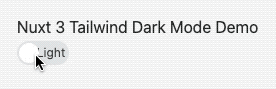
Finally, we can test our dark mode theme switch at `http://localhost:3000`:
## StackBlitz Demo[](#stackblitz-demo)
My simple demo is available as interactive StackBlitz demo:
%[https://stackblitz.com/github/bnmipwkmo?embed=1]
Alternatively, you could also use the [color-mode](https://color-mode.nuxtjs.org/) module that supports Nuxt Bridge and Nuxt 3.
## Conclusion[](#conclusion)
This article showed you how to create a simple dark mode switch in Nuxt 3 with Tailwind CSS v3. You can expect more Nuxt 3 posts in the following months as I plan to blog about interesting topics that I discover while I rewrite my portfolio website.
If you liked this article, follow me on [Twitter](https://twitter.com/mokkapps) to get notified about new blog posts and more content from me.
Alternatively (or additionally), you can also [subscribe to my weekly Vue.js newsletter](https://mokkapps.de/newsletter).