

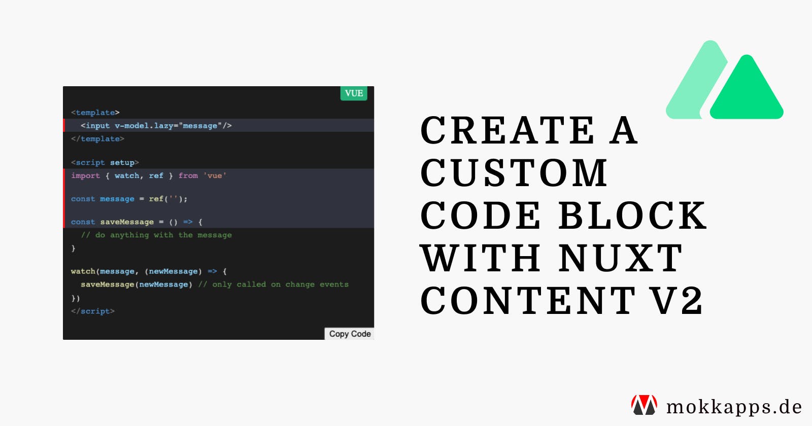


Code blocks are essential for blogs about software development. In this article, I want to show you how can define a custom code block component in Nuxt Content v2 with the following features:
- Custom styling for code blocks inside Markdown files
- Show language name (if available)
- Show file name (if available)
- Show a “Copy Code” button
Nuxt Content v2
Nuxt Content v2 is a Nuxt 3 module that reads local files from the /content directory in your project. It supports .md, .yml, .csv and .json files. Additionally, it’s possible to use Vue components in Markdown with the MDC Syntax.
Setup Nuxt App
First, let’s start a new Nuxt Content project with:
npx nuxi init nuxt-custom-code-blocks -t content
Then we need to install the dependencies in the nuxt-custom-code-blocks folder:
yarn install
Now we can start the Nuxt content app in development mode:
yarn dev
A browser window should automatically open for http://localhost:3000. Alternatively, you can start playing with Nuxt Content in your browser using StackBlitz or CodeSandbox.
The following StackBlitz sandbox demonstrates the application we create in this article:
Custom Prose Component
Prose represents the HTML tags output from the Markdown syntax in Nuxt Content. Nuxt Content provides a Vue component for each HTML tag like links, title levels, etc.
It’s possible to override these Vue components, which is precisely what we’ll do to create a custom code block component.
To customize a Prose component, we have to perform these steps:
- Check out the original component sources.
- Use the same props.
- Name it the same in our
components/content/directory.
In our example, we want to override ProseCode, which is Nuxt Content’s default Vue component to render code blocks in Markdown files.
This component accepts the following props:
code: the provided code as a stringlanguage: the provided language namefilename: the provided filenamehighlights: a list of highlighted line numbers
Let’s take a look at how we can set these values in a Markdown file:
js [src/index.js] {1, 2-3}
  const a = 4;
  const b = a + 3;
  const c = a * b;
In the above example:
jsis the value passed to thelanguagepropsrc/index.jsis the value passed to thefilenameprop[1, 2, 3]is the value passed to thehighlightsprop
To override the component, we create ProseCode.vue in the components/content directory and use the exact same props that are defined in the default component:
<template>
  <slot />
</template>

<script setup lang="ts">
const props = withDefaults(
  defineProps<{
    code?: string;
    language?: string | null;
    filename?: string | null;
    highlights?: Array<number>;
  }>(),
  { code: '', language: null, filename: null, highlights: [] }
);
</script>
Now we can customize this component however we want.
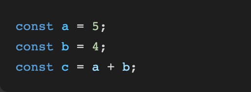
Style Container
First, we want to style the container that includes the code. Therefore, we wrap the <slot /> in a div and style it:
<template>
  <div class="container">
    <slot />
  </div>
</template>

<style scoped>
.container {
  background: #1e1e1e;
  position: relative;
  margin-top: 1rem;
  margin-bottom: 1rem;
  overflow: hidden;
  border-radius: 0.5rem;
}
</style>
Let’s take a look at our custom code block:
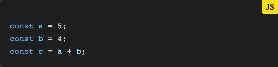
Show Language
Next, we want to show the name of the language on the top right, if it is available.
<template>
  <div class="container">
    <span v-if="languageText" :style="{ background: languageBackground, color: languageColor }" class="language-text" > {{ languageText }} </span> <slot />
  </div>
</template>

<script setup lang="ts">
const props = withDefaults(
  defineProps<{
    code?: string;
    language?: string | null;
    filename?: string | null;
    highlights?: Array<number>;
  }>(),
  { code: '', language: null, filename: null, highlights: [] }
);

const languageMap: Record<
  string,
  { text: string; color: string; background: string }
> = {
  vue: {
    text: 'vue',
    background: '#42b883',
    color: 'white',
  },
  js: {
    text: 'js',
    background: '#f7df1e',
    color: 'black',
  },
};

const languageText = computed(() =>
  props.language ? languageMap[props.language]?.text : null
);
const languageBackground = computed(() =>
  props.language ? languageMap[props.language]?.background : null
);
const languageColor = computed(() =>
  props.language ? languageMap[props.language]?.color : null
);
</script>

<style scoped>
.container {
  background: #1e1e1e;
  padding-top: 1em;
}

.language-text {
  position: absolute;
  top: 0;
  right: 1em;
  padding: 0.25em 0.5em;
  font-size: 14px;
  text-transform: uppercase;
  border-bottom-right-radius: 0.25em;
  border-bottom-left-radius: 0.25em;
}
</style>
We define a map called languageMap that contains the displayed text, the CSS background, and text color for each programming language. We style the span tag that renders the language inside our template based on this map and the provided language prop:
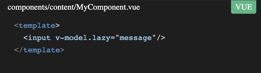
Show File Name
Next, we want to show the file’s name on the top left, if it is available:
<template>
  <div class="container">
    <span v-if="filename" class="filename-text">
      {{ filename }}
    </span>
    <slot />
  </div>
</template>

<style scoped>
.filename-text {
  position: absolute;
  top: 0;
  left: 1em;
  padding: 0.25em 0.5em;
  color: white;
  font-size: 14px;
}
</style>
The result looks like this:
Add Copy Code Button
Finally, we want to show a button that copies the code to the clipboard. Therefore, we use the useClipboard composable from VueUse:
<template>
  <div class="container">
    <slot />
    <div class="bottom-container">
      <div class="copy-container">
        <span class="copied-text" v-if="copied">Copied code!</span>
        <button @click="copy(code)">Copy Code</button>
      </div>
    </div>
  </div>
</template>

<script setup lang="ts">
import { useClipboard } from '@vueuse/core';

const { copy, copied, text } = useClipboard();
</script>

<style scoped>
.bottom-container {
  display: flex;
  justify-content: flex-end;
}

.copy-container {
  display: flex;
}

.copied-text {
  margin-right: 1em;
}
</style>
Let’s take a look at the final result with language & file name, copy code button, and line highlighting:
Conclusion
Custom code blocks are essential for my blog as my blog posts contain a lot of code snippets. Features like copy code or line highlighting provide excellent value to my readers, and it is straightforward to add such features by creating a custom code block component in Nuxt Content v2.
The source code of this demo is available at GitHub or as StackBlitz sandbox.
You can expect more Nuxt 3 posts in the following months as I plan to blog about interesting topics that I discover while rewriting my portfolio website.
If you liked this article, follow me on Twitter to get notified about new blog posts and more content from me.
Alternatively (or additionally), you can also subscribe to my newsletter.